In the age of data, where organizations are inundated with an ever-expanding stream of information, making sense of it all has become a critical challenge. This is where data visualization in business intelligence (BI) comes to the forefront as an invaluable tool for transforming raw data into actionable insights.
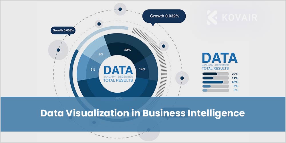
What is Data Visualization?
Data visualization is the graphical representation of data to make it more understandable and accessible. It involves the use of charts, graphs, maps, and other visual elements to present complex data sets in a way that is easy to comprehend. The primary goal of data visualization is to help individuals and organizations analyze data, identify patterns, trends, and insights, and make informed decisions based on the information presented.
Role of Data Visualization in Business Intelligence
Data visualization plays a critical role in Business intelligence by helping users to:
- Identify trends and patterns – Data visualization can help users quickly and easily identify trends and patterns in their data. This can be useful for identifying areas where the business is performing well, as well as areas where there is room for improvement.
- Make better decisions – Data visualization can help users make better decisions by providing them with the insights they need to understand their data. For example, a data visualization might show that a particular product line is performing poorly. This insight could lead the business to make changes to the product line or to discontinue it altogether.
- Communicate insights to others – Data visualization can be used to communicate insights to others in a clear and concise way. This can be helpful for sharing insights with stakeholders, such as managers, investors, and customers.
Types of Data Visualizations
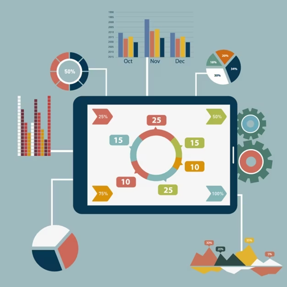
There are many different types of data visualizations that can be used in BI. Several prevalent varieties include:
- Charts – Charts are a popular type of data visualization that uses bars, lines, and other geometric shapes to represent data.
- Graphs – Graphs are another popular type of data visualization that uses axes to plot data points.
- Maps – Maps can be used to visualize data that is geospatial in nature, such as sales data by region.
- Tables – Tables are still a valuable tool for visualizing data, especially when the data is complex or needs to be presented in a very specific way.
What are the benefits of using Data Visualization in BI?
There are many benefits to using data visualization in BI, including:
- Improved understanding of data: Data visualization can help users to better understand their data by making it easier to see patterns and trends.
- Faster decision-making: Data visualization can help users make faster decisions by providing them with the insights they need quickly and easily.
- Better communication: Data visualization can help users to better communicate insights to others by making them easier to understand and remember.
How is Data Visualized in BI?
Data is visualized in BI using a variety of tools and techniques, including:
- Dashboards: Dashboards are centralized displays that provide users with a quick overview of their most important data. Dashboards can include a variety of data visualizations, such as charts, graphs, and maps.
- Reports: Reports are detailed documents that provide users with in-depth information about their data. Reports can include a variety of data visualizations, as well as text and tables.
- Ad hoc visualizations: Ad hoc visualizations are one-off visualizations that are created to answer specific questions about the data. Ad hoc visualizations can be created using a variety of data visualization tools, such as Microsoft Excel and Tableau.
Important tools for Data Visualization in BI
There is a plethora of tools available for creating data visualizations in Business Intelligence. Some popular ones include:
- Tableau – Known for its user-friendly interface and powerful capabilities, Tableau is widely used for data visualization and BI.
- Power BI – Developed by Microsoft, Power BI offers robust data visualization and integration with other Microsoft products.
- QlikView/Qlik Sense – Qlik offers both QlikView and Qlik Sense for data visualization, with a focus on data discovery and user-driven analytics.
- D3.js – For those with coding skills, D3.js is a JavaScript library that provides extensive control over data visualization.
- Google Data Studio/Looker Studio – A free tool by Google that allows for creating interactive and shareable dashboards.
Here are a few examples of how data is visualized in BI
- A sales manager might use a bar chart to visualize sales data by region. This would help the manager to identify which regions are performing well and which regions need more attention.
- A marketing manager might use a line graph to visualize website traffic data over time. This would help the manager to identify trends in website traffic and to track the effectiveness of marketing campaigns.
- A product manager might use a scatter plot to visualize the relationship between two different product features. This would help the manager to identify how changes to one feature might impact the other feature.
- A CEO might use a dashboard to visualize key performance indicators (KPIs) for the business. This would help the CEO to quickly and easily see how the business is performing and to identify any areas of concern.
Data visualization is a powerful tool that can help you make better decisions, communicate more effectively, and advance your career.
Why is it necessary to learn Business intelligence by using Data Visualization?
Learning Business intelligence with data visualization is necessary because it can help you to:
- Make better decisions – Data visualization can help you make better decisions by providing you with the insights you need to understand your data. For example, a data visualization might show that a particular product line is performing poorly. This insight could lead you to make changes to the product line or to discontinue it altogether.
- Communicate more effectively – Data visualization can help you communicate more effectively by making it easier for others to understand your data. For example, you could use data visualization to explain a complex business concept to a stakeholder or to present your findings from a research project to your team.
- Advance your career – Data visualization is a highly in-demand skill, and learning BI with data visualization can make you more competitive in the job market.
Conclusion
Data visualization is at the heart of Business Intelligence. It empowers organizations to make data-driven decisions, uncover insights, and communicate complex information effectively. By following best practices and choosing the right tools, businesses can harness the full potential of data visualization to thrive in an increasingly data-centric world. As data continues to grow in volume and complexity, the role of data visualization in BI will only become more critical in shaping the future of business.


Impressive insights! Data visualization is integral to BI success. Any thoughts on incorporating AI into data visualization tools for predictive analytics? Thanks for highlighting the pivotal role of visually presenting data in the field of business intelligence.